10 HTML CSS JavaScript Projects for Beginners That Build Real Skills
Ten small browser projects that teach real skills and give a recruiter something to click. Each comes with the one mistake that breaks it, plus code you can copy.
Say you have sent sixty job applications and heard back from none. A recruiter opens your resume for a few seconds, then looks for a link to something you built. A list of skills gives them nothing to click. This post gives you ten small builds that fill that gap, and each one comes with the one mistake that breaks it.
Pick one project, build it fully, put it online, and link it on your resume; start with the to-do list.
Login form with validation
A login form teaches you how HTML inputs, CSS layout and a JavaScript submit handler fit together, so it is the best first build.
You need two fields: one for the email and one for the password. Give each one a <label>, because a screen reader reads the label aloud and a click on it focuses the input. Under each field, keep an empty <p> where your script writes a short error message.
<form id="login"> <!-- the browser checks required fields -->
  <label for="email">Email</label>
  <input id="email" type="email" required>
  <p class="error" id="email-error"></p>
  <label for="password">Password</label>
  <input id="password" type="password" required minlength="8">
  <p class="error" id="password-error"></p>
  <button type="submit">Log in</button>
</form>
The pitfall here is checking everything in JavaScript and skipping the HTML attributes. If your script has a typo and stops running, a form without required and type="email" accepts an empty box. With those attributes, the browser still blocks the bad input. Treat your JavaScript checks as a second layer that writes friendlier messages. Here is the key part of that handler:
const form = document.getElementById("login");
form.addEventListener("submit", function (event) {
  const email = document.getElementById("email");
  if (!email.validity.valid) {
    event.preventDefault();
    document.getElementById("email-error").textContent = "Enter a valid email address.";
  }
});
For practice designs, Frontend Mentor's project ideas page sorts challenges by technology and skill level. Pick a beginner design and match it closely. Copying a real design is harder than inventing your own, and that is the point.
To-do list that survives a page reload
A to-do list is the build to do properly, because it forces you to handle form submits and page updates in one small app, then save the data.
This video builds a similar to-do app step by step; the code below adds saving with localStorage and explains the preventDefault bug.
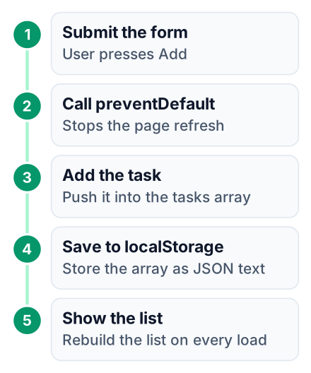
This is the worked example of the post. Copy the three blocks into one folder, open the HTML file, and follow the output at each step. The pattern matches the hackr.io to-do list tutorial, with saving added.
The HTML
<!DOCTYPE html>
<html lang="en">
<head>
  <meta charset="UTF-8">
  <meta name="viewport" content="width=device-width, initial-scale=1">
  <title>To-do</title>
  <link rel="stylesheet" href="style.css">
</head>
<body>
  <main>
    <h1>My tasks</h1>
    <form id="task-form">
      <input id="task-input" type="text" placeholder="Add a task" required>
      <button type="submit">Add</button>
    </form>
    <ul id="task-list"></ul>
  </main>
  <script src="app.js"></script>
</body>
</html>
What you see: a heading, a text box with an Add button, and nothing below it.
The CSS
body {
  font-family: system-ui, sans-serif;
  background: #f4f4f4;
}
main {
  max-width: 28rem;
  margin: 2rem auto;
  padding: 1rem;
  background: #fff;
  border-radius: 8px;
}
form {
  display: flex;
  gap: 0.5rem;
}
input {
  flex: 1;
  padding: 0.5rem;
}
li {
  padding: 0.5rem 0;
  border-bottom: 1px solid #ddd;
}
In the browser: the same page, now centred in a white card. The input stretches to fill the row next to the button.
The JavaScript
const form = document.getElementById("task-form");
const input = document.getElementById("task-input");
const list = document.getElementById("task-list");
// Load saved tasks, or start with an empty array
let tasks = JSON.parse(localStorage.getItem("tasks")) || [];
function render() {
  list.innerHTML = "";
  tasks.forEach(function (text) {
    const li = document.createElement("li");
    li.textContent = text;
    list.appendChild(li);
  });
}
function addTask(event) {
  event.preventDefault(); // stop the browser from reloading the page
  const text = input.value.trim();
  if (text === "") return;
  tasks.push(text);
  localStorage.setItem("tasks", JSON.stringify(tasks));
  input.value = "";
  render();
}
form.addEventListener("submit", addTask);
render();
Try it yourself: type "Revise arrays" and press Enter. The task appears under the form and the box clears. Press F5 to reload. "Revise arrays" is still there.
Pitfall one is leaving out event.preventDefault(). A form's default action is to send its data and load a new page. Without that line, your task flashes on screen and vanishes as the page reloads. Delete the line, try it, and watch it happen. Seeing the bug once makes it easy to spot in an interview. A typical question is "Why did my form reload the page?" A short answer: "A form's default action is to submit and load a new page, so I call preventDefault() in the submit handler to stop it."
The second mistake is skipping storage entirely, so every reload wipes the list. MDN's Storage page explains that setItem takes a string as its value. An array is not a string, so you convert it with JSON.stringify before saving. Then JSON.parse turns it back into an array on load.
Once front-end apps feel easy, add a server and a database. My list of full-stack projects with source code is the step after this one.
Calculator
A calculator teaches event listeners on many buttons and how to keep one piece of state, the current number, in sync with the screen.
Lay out the buttons with CSS Grid: grid-template-columns: repeat(4, 1fr) gives four equal columns. Give each button a data-value attribute, like data-value="7" or data-value="+". Then attach one click listener to the button container and read event.target.dataset.value. One listener is easier to debug than a separate one for every key.
The pitfall is passing the typed string to eval(). It works, but eval runs any code it is given, and interviewers like to ask why that is dangerous. Store two numbers and an operator instead, then do plain arithmetic:
function compute(a, operator, b) {
  a = Number(a);
  b = Number(b);
  if (operator === "+") return a + b;
  if (operator === "-") return a - b;
  if (operator === "*") return a * b;
  if (operator === "/") return b === 0 ? "Error" : a / b;
}
Calculators sit on the 100 JS Projects beginner list next to to-do lists and games. Make yours different with keyboard support: listen for keydown and reuse the same handler.
Digital clock and countdown timer
These two small builds teach setInterval, the browser's timer function, and how to stop it cleanly.
The clock creates a new Date() once per second and writes the hours and minutes to the screen. For the countdown, subtract the current date from a target date. The result is in milliseconds, and you divide it down into days, then hours, then minutes and seconds.
Clock pitfall: a time like 9:5:3 instead of 09:05:03. Fix it with String(minutes).padStart(2, "0"), which adds a leading zero to single digits.
const clockEl = document.getElementById("clock");
function pad(n) {
  return String(n).padStart(2, "0");
}
function tick() {
  const now = new Date();
  clockEl.textContent = pad(now.getHours()) + ":" + pad(now.getMinutes()) + ":" + pad(now.getSeconds());
}
tick();
setInterval(tick, 1000);
Countdown pitfall: starting a new timer on every click of Start. Each click adds another interval, and the numbers begin to jump two or three seconds at a time. Save the timer's ID and clear it first:
let timerId = null;
function start() {
  clearInterval(timerId);
  timerId = setInterval(updateCountdown, 1000);
}
The 100 JS Projects list counts setInterval among its core beginner concepts. Here is what each build adds:
- Clock: working with dates and formatting numbers for display.
- Countdown: date arithmetic, plus starting and stopping a timer safely.
Quiz app
A quiz app shows you how to keep your questions as plain data objects and render them, rather than writing each question into the HTML by hand.
You need four things: a list made of question objects, an index for the current question, a score, and a result screen at the end. Adding a question then means adding one object, with no HTML to touch.
const questions = [
  { text: "Which tag links a CSS file?", options: ["<style>", "<link>", "<css>"], answer: 1 },
  { text: "Which method stops a form reload?", options: ["stop()", "preventDefault()", "halt()"], answer: 1 }
];
const questionEl = document.getElementById("question");
const optionsEl = document.getElementById("options");
let current = 0;
let score = 0;
function renderQuestion() {
  const q = questions[current];
  questionEl.textContent = q.text;
  optionsEl.innerHTML = "";
  q.options.forEach(function (option, i) {
    const btn = document.createElement("button");
    btn.textContent = option;
    btn.addEventListener("click", function () { choose(i); });
    optionsEl.appendChild(btn);
  });
}
function choose(i) {
  const buttons = optionsEl.querySelectorAll("button");
  buttons.forEach(function (b) { b.disabled = true; });
  if (i === questions[current].answer) score++;
}
The pitfall is letting someone click the right answer five times and score five points. Inside choose(), set disabled = true on every option button after the first click. Then show a Next button.
Interviewers ask about this pattern as "separating data from display." Your quiz is a short, honest answer to that question.
Weather app with the fetch API
A weather app is your first project that talks to a server, and it teaches you that network requests can fail.
The user types a city, your code calls a free weather API, and the page shows the city's temperature with a short description. API integration is one of the beginner project types on Frontend Mentor's use-cases page.
You will see async and await here. In plain words, await tells the function to wait for the server's reply before it moves to the next line. Open-Meteo is a free weather API that needs no key, and its documentation gives the address to call. In the code below, API_URL is a placeholder for that address, and the query part of the request depends on the API you choose.
async function getWeather(city) {
  try {
    const response = await fetch(API_URL + "?q=" + encodeURIComponent(city));
    if (!response.ok) {
      throw new Error("City not found");
    }
    const data = await response.json();
    showWeather(data);
  } catch (error) {
    errorEl.textContent = "Could not load weather: " + error.message;
  }
}
The pitfall is assuming every request succeeds. Type a city that does not exist and an unprotected app prints "undefined" on the screen. The value response.ok is true when the server replies with success, so checking it catches the server saying no. The function encodeURIComponent turns a city like "New York" into "New%20York" so the space cannot break the web address. The try/catch catches a dropped connection. Both end with a message the user can read.
One more warning: never publish a paid API key in front-end code. Anyone can open DevTools and copy it. Use an API with a free tier, or one that needs no key. When a request fails, the error text is your best clue, and my guide to reading your first server error log shows how to read it.
Image gallery with filter buttons
A filterable gallery teaches you how to show and hide groups of elements by changing classes instead of rewriting the page.
Give each image a data-category, such as "beach" or "mountain". Each filter button carries the same attribute. On click, loop over the images and toggle one class:
function filter(category) {
  images.forEach(function (img) {
    const match = category === "all" || img.dataset.category === category;
    img.classList.toggle("hidden", !match);
  });
}
Your CSS then needs one rule, .hidden { display: none; }, plus a hover effect such as transform: scale(1.05).
The pitfall is writing img.style.display = "none" all over your script. Later, to fade images out instead, you would hunt through every line. With one class, you change one CSS rule.
Use free-licence photos. File names need care too: Beach.jpg and beach.jpg are the same file on Windows, but most hosting servers treat them as different. A gallery that works on your laptop can show broken images online for exactly this reason.
Product landing page
A landing page shows recruiters that you can turn a design into clean HTML and CSS, which is most of what front-end work involves.
Landing pages appear among the project types on Frontend Mentor's use-cases page. Build a hero section with a headline, then a grid of features. End with a clear call-to-action button.
The pitfall is a page made of nested div tags with fixed pixel widths. It looks fine on your screen and breaks on a phone. Use semantic tags, and size things with rem, % and max-width instead of fixed pixels.
| Tag | What it replaces | Why it matters |
|---|---|---|
<header> | <div class="top"> | Screen readers announce it as the page header |
<nav> | <div class="menu"> | Lets keyboard users jump straight to the links |
<main> | <div class="content"> | Marks the core content for screen readers and search engines |
<section> | <div class="block"> | Groups related content under its own heading |
<footer> | <div class="bottom"> | Signals contact and legal links to assistive tools |
Your landing page only helps you if a recruiter can open it. My comparison of free web hosting platforms shows where to put it online at no cost.
Responsive tourism website
A responsive tourism site pulls every earlier skill into one multi-section page that works on a phone and a laptop.
Pick a real place, such as Darjeeling or Yosemite. Build navigation that collapses into a menu button on small screens. Lay out the destinations with CSS Grid or Flexbox. Your booking form can reuse the checks from the login form, and your photo section can reuse the gallery filter.
The pitfall is leaving out this one line in the <head>:
<meta name="viewport" content="width=device-width, initial-scale=1">Without it, a phone pretends to be a wide desktop screen and shrinks the whole page. Your media queries look broken, yet the real cause is that missing tag.
Build mobile-first: write the phone styles as your default, then add @media (min-width: 48rem) for larger screens. Follow this order:
Layout
Write the semantic HTML for every section, with no styling yet.
Mobile styles
Style for a narrow screen first: one column and a collapsed menu.
Desktop styles
Add media queries for wider screens: grid columns and the full menu.
Form
Add the booking form with HTML validation and a JavaScript submit handler.
Publish
Put the site online and add the live link to your resume.
Pick the project that matches your level: the login form or to-do list if you are new, the weather app if you already know functions, the tourism site if you want a portfolio piece. This week, build the to-do list with the code above and put it online on free hosting (see my comparison of free web hosting platforms; the first step is to create a free account and upload your three files). Then add the link to your resume, with one sentence about the preventDefault bug you fixed.